Wednesday, October 31, 2012

The Ins and Outs of Editing

When I first started planning for my video project that will highlight four more Upstate restaurants that I have uncovered, I have to admit I was a little nervous. I have never really shot video footage before, with the exception of playing around on my iPhone, of course. I was apprehensive about asking restaurant owners to let me film, shooting the footage itself, and editing the clips to make a seamless story of my eatery adventures. I doubted myself and my video making abilities. After reading the chapter The "Aesthetics of Editing" in Ronald Osgood and Joseph Hinshaw's work Visual Storytelling, I feel like I am much informed and prepared for video editing.

While the chapter discusses many important techniques of editing, I will focus on three that I find important and want to use in my video. Those three techniques are listed and quickly defined below.


  • b-roll or footage that visually describes the story 
  • continuity or maintaing story consistency from shot to shot and within scenes 
  • establishing shot or a shot providing indication of the location of the scene 
The chapter suggests that b-roll helps to describe the story visually while a person is speaking about the topic at hand. I plan to use b-roll with each of my restaurants while interviewing owners and friends. While the person I am interviewing answers questions about the restaurant or the experience, I will cut to clips of different images/scenes in the restaurant such as a close up of the food or friends ordering at the counter. 

Osgood and Hinshaw also state that keeping continuity in my video "helps to add to the believability of the scene and maintains realism". In the filming I have already done, I have been very careful to shoot footage that connects, makes sense, and pieces the story together in an obvious manner. Since my topic is fun and personal, I don't want to confuse my viewers with unrelated, unconnected jump cuts. Instead, I want them to feel as if they were along for the journey by making it easy for them to see why I have enjoyed uncovering all these delicious restaurants. Continuity will help achieve this goal. 

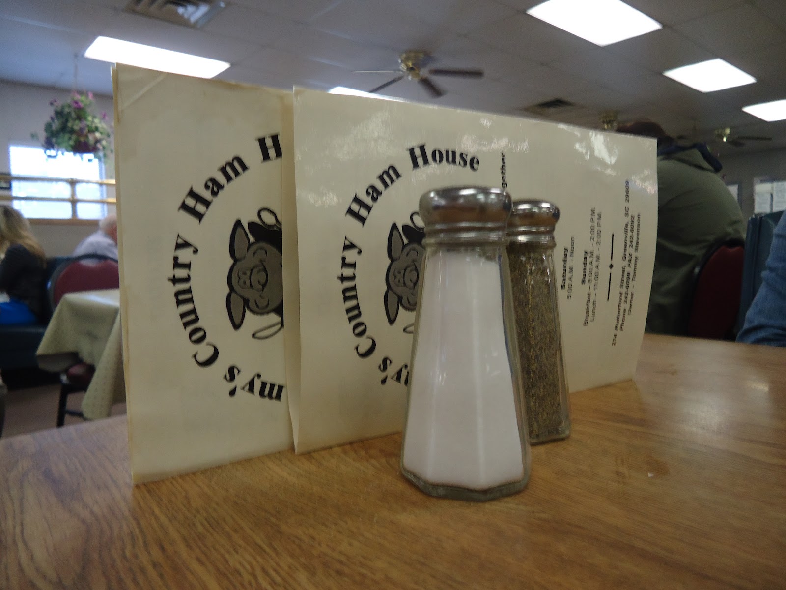
The final technique that I think will add to my video is the use of establishing shots. The chapter discusses the importance of letting the audience know where a scene is taking place by way of an establishing shot or a cue in the dialogue. In my shots, I have been starting every time with a clip of the front of the restaurant, highlighting the sign especially. This will hopefully show my audience where the next scene will take place, keeping them informed and interested. 


For someone who has little experience with filming and editing, reading helpful tips such as those in this chapter help immensely. What techniques are you excited to try in your future filming and editing? Do you find it harder to film and get the right shots or edit your filmed material? 

Wednesday, October 24, 2012

Pointing Out Point of View

Point of view is something we have heard about our whole lives. In my experience, point of view was usually brought up in an English class in relation to a novel or poem we were reading at the time. I would have to decide, it is first person, third person, second person in the "you" form? While I admit it was never the most exciting thing to learn about, point of view is very important in all aspects of life. It is crucial to know whose point of view a story is being told from, what it is supposed to mean, and who it is supposed to target. In the article The Art of Technique by John Douglass and Glenn Harnden, chapter 3 is titled Point of View.

While this chapter deals with the same first, second, and third person lessons we have been taught over and over again in classes past, I particularly enjoyed the portion on point of view and attitude. It brings to light phenomenon that we as consumers of media deal with everyday - conflicting point of view pieces and texts addressing the same topic. The chapter referenced conflicts such as depictions of the Catholic church and French Colonial occupation of North Africa and how they might be received differently based on different points of view. However, being a 20 year old female, the example that stuck out to me the most was that of the portrayal of love. To me a perfect example is the popular Nicholas Sparks novel-based film, The Notebook. The article beautifully balances first and third person narration as well as plays to different audiences with different points of view. Again to me, the girl that falls too quickly, loves a good cry, and likes to hope that fairytales do exist, the movie appeals perfectly to my point of view and attitude. However, show The Notebook to a 20 year old male and the sentiment might be quite different. The point of view and attitude just might not line up.


After looking at this example, it is easy to see why we should be thanking our high school English teachers for hammering point of view into our brains. As a producer, or in our case, the creator of a class video, it is crucial to understand point of view to not only know how our work will be taken but also how are specific audiences will be touched.

What are some examples of effective use of point of view? Can you think of other popular movies that may reach audiences very differently? Can you appreciate movies and texts even if they don't line up with your specific point of view or attitude?

Monday, October 22, 2012

Experience Design: Crafting a Masterpiece


When I first saw the title of the article Experience Design by Nathan Shedroff, I will admit I was a little bit confused. Of course I know what the word experience means and what the word design means, but what I didn't know was that there is a growing field dedicated to "designing experiences". If you are anything like me, you are probably thinking "Wait, what? Experiences are something to be crafted, not events that just occur"? While this was my first thought, Shedroff's article showed me that "there is something important and special to many experiences that make them worth discussing". Going even deeper, the article taught me that in order to design a certain experience, there are components that can be learned and copied to recreate effective experiences.

One thing that was a bit frustrating with the article was the way in which it jumped around so frequently, talking one minute about surfers experiencing a no nonsense surfing website and the next about a simple form created by a company to make tax returns more understandable. While this theme made it a little hard for me to focus at times, I think the main reason for Shedroff taking this approach was to support his earlier claim that "all experiences are important". It doesn't matter whether you are experiencing a touching Holocaust museum or playing with an online coloring book, all experiences tell us something about ourselves and can be designed in a way to be the most efficient, effective, and enjoyable experiences possible.

Since there was an array of topics discussed, I want to focus quickly on the section about blogging- it is only fitting, right? In talking about blogging, Shedroff states, "Experiences that allow people to communicate with each other or simply to be heard tend to be rewarding, satisfying ones". It makes me happy that in this young field of Experience Design, it is being realized that people respond well to having a place to communicate openly, freely, and personally (within some design limits, of course). In a world where technology is always changing and advancing, I find it crucial for the people in the world who are designing blog websites - and for that matter designing how we experience blogging- to be able to create blogging tools that allow further communication, personality, and interactivity.

To me, having a place to spill out my creativity and my feelings (this blog!), is liberating and comforting. It is easy for my ideas and thoughts to feel lost in a world where conversations over text messaging tend to be replacing conversations in person. While blogging is still an online, text driven form of communication, it allows me an experience of sharing my experiences, and hopefully inspiring others to share their experiences as well.

Do you think Experience Design is a necessary and useful field? Why or why not? In what ways do bloggers you follow share their experiences as well as inspire you to share your experiences? Do you agree with Shedroff on the importance of having experiences that allow us to share?

Thursday, October 18, 2012

The Screen Has Become the Queen

Let's face it, in today's electronically driven world, the screen -whether it be movie, television, or computer- dominates the way we view and receive information and entertainment. We watch movies in 3D, catch up on our favorite TV shows on computer websites like Hulu, and read our books on screened devices like the Nook or the Kindle.

While it seems pretty apparent to the average viewer that watching a program or movie on a screen is definitely different than looking at the real world around us, it may not be obvious all the ways in which the screen defines how the image or show appears in our eyes. The article, The Two-Dimensional Field: Forces Within the Screen, clearly and plainly lays out for us the six major types of field forces that influences the way images and shows appear within the confines of a screen. While the article discusses all six - main directions, magnetism of the frame and attraction of mass, asymmetry of the frame, figure and ground, psychological closure, and vectors- I found the rules for figure and ground to be the most fascinating and will talk about them here.

The article states that figure and ground is "one of the most elemental structural forces operating within the screen". I took this to mean that it is important for us to know what the figure is and where the ground is located in an image in order for us to establish the certain breaks in object and ground within the screen. To help differentiate the object from the ground, the article lists these 5 easy steps to keeping to all clear.


  • The object is thinglike. 
  • The figure lies in the front of the ground.
  • The line that separates the figure from the ground is part of the figure, not the ground.
  • The figure is less stable than the ground; the figure is more likely to be moved. 
  • The ground seems to continue behind the figure.
These are all important tips as either a viewer or a creator of screened images and shows. I now know that when uploading pictures to the internet that I want viewer to perceive in a certain way, I can change the perception of ground and object to read however I want, even blending the two together or creating different grounds/objects when looked at two different ways, such as with the images below. By using placement of the object and ground as well as movement and ground, I can make the viewer perceive things of the image even if they are not necessarily true. 


What images/advertisements can you think of that blur the lines of object/ground? Are they effective in drawing you in? How would you use image/ground to lead an audience to a certain perception? 

Wednesday, October 17, 2012

The Upstate Uncovered: Putting Words to the Images


The Upstate Uncovered is an audio/slideshow combination that describes my experience uncovering local Upstate South Carolina restaurants. The four restaurants featured are Tommy's Country Ham House, Brick Street Cafe, The Little Coffee Pot, and The Mason Jar.

Special thanks to Anna Fluevog, Elizabeth Griffin, Maggie Austin, and Morgan Black for joining me on this adventure and speaking about their experiences.
Music Credit: Copyright Zac Brown Band - Song Title: Chicken Fried

Wednesday, October 10, 2012

A Little Bit of This and A Little Bit of That

In trying to use titles that catch my readers attention and draw them in, I chose the above mentioned, slightly vague blog title that leaves one guessing what this post would be. When I first read the title of this weeks reading, Multimodal Polyphony, by Anders Fagerjord, I was left with a similar feeling of guessing. Upon first glance, I was overwhelmed and wasn't sure what I could learn from the study of a Flash Documentary. After diving in, however, I have learned many ways to use "a little bit of this and a little bit of that" to make a combined media masterpiece.

Fagerjord's article chose to analysis in detail National Geographic's flash documentary, or "documentary films of still images and voice-over commentary," entitled "Sights and Sounds from the Way West".  If you choose to click the link and watch "The Way West" for yourself, you will discover a coming together of different media forms that culminates in a story of a historic journey West that is told so well using a number of different techniques. The flash documentary features visual elements such as paintings, writing, photography, and camera placement as well as elements that appeal to the ears such as music, speech, and sound effects.

While I found both the finished product of "The Way West" and the article by Fagerjord very interesting, the main point I took away (and hope to apply to my podcast) is the importance of images and words used in connection with one another. To me, images and words alone can both catapult our minds to great places, letting our imaginations soar. For some forms of media, this is the desired effect. Again in my eyes, the flash documentary has so much power and meaning because it combines visual aspects and words into one flowing piece in which the audience knows exactly the main focus and purpose of the work.

When I am setting out to learn more about a specific topic, such as the experience of historic people journeying to the West, or in our case a classmate's experience taking photographs for a blog, I prefer to know what is supposed to be taken from the image or from the story in the form of words. By using "a little bit of text" and "a little bit of visual stimulants", the final product is a clear and beautiful portrayal of an experience of a fellow human being. Because of this article, I am more excited than ever to begin work on my podcast and start putting words to my images, bringing the slideshow full circle.

While I am personally a fan of images and text working side by side, it begs to be asked, how do you feel about multimodal pieces such as "The Way West"? Do you think images and words work well together in explaining the purpose of the piece or do you think it takes away a sense of imagination and interpretation given to the audience?

Wednesday, October 3, 2012

Open Your Ears, Not Your Eyes

Buzz, buzz, buzz. Tick, tick, tick. "That's a lot of tweeting". As I sit here in my apartment, writing this blog post on our newest reading, The Zen of Listening, I hear a plethora of noises around me. The vent of our AC makes a slightly annoying buzz. The clock on our collage wall ticks in a steady rhythm. My roommates voices discuss the social media going on with the presidential debate. Prior to this reading, I probably wouldn't have been acutely aware of these sounds. I probably would have drowned them out while working away in my chair in the corner of the living room.

Because listening is so innate, I have never taken much time to think about the act of listening and how it relates to the way we consume media, specifically radio. Just as listening is innate, as the article mentions, my love of radio seems innate as well. When I get in my car, the radio comes to life immediately, usually set to 99.9, my favorite country station. I sing along with songs, let it play softly in the background, and flip the channels when I am tired of hearing commercials. It is all so natural, right?

Two of the points in the article I enjoyed the most were the discussion of our love of radio due to the power listening has on our imagination and the idea that radio was the first and remains one of the best ways to feel a mutual sense of connection at the same time as people all over the world.


The article discusses in depth the ways in which the radio allows us to take the voices and situations we hear on the radio and turn them into whatever we want. We can imagine what the DJ looks like, where a newscaster is reporting from, and how a song would play out in a video in our minds. People love radio, myself included, for the same reason they love tangible, worn in books. Yes a movie can perfectly put into visuals the characters or setting from your favorite book. But when happens, the creation of your own mind imagination is crushed. In order for people to grow as imaginative individuals, the opportunity must be given to think and create on your own. Radio does just that.

I also enjoyed the brief history of radio and the ways in which it was such a revolutionary invention when it first become widely used. In the past, the radio was a coveted piece of technology, used to connect people and pass information over miles and miles. Today, I believe we take the radio for granted, not recognizing the way in which it still represents a single moment in time, very much the same, and being shared by millions of people at the same time. It is very personal in the way we can apply our imagination and very communal in the way we share it with so many other people.


Do you still listen to the radio frequently? If not, what do you use to listen to music and other broadcasted information? An iPod, Pandora, other?
What do you like about radio that you don't think TV can offer?

Monday, October 1, 2012

The Upstate Uncovered


These 20 pictures represent the nature and atmosphere of the four Upstate South Carolina restaurants I have recently uncovered. My goal is to tell the story of the restaurant through the images by capturing and editing them in a way that makes you feel as if you were there dining with me. The restaurants featured are Tommy's Country Ham House, Brick Street Cafe, The Little Coffee Pot, and The Mason Jar. Enjoy!

Capturing Moments: Before and After


In the image above the Rule of Thirds is being put into place. This rule states that the main focus of the image should be placed on or near one of the crossing points of the horizontal and vertical grid lines. In this case, my main focus is the coffee mug which lines up with the top, left crossing point.